MOB: from design system to source of truth
How I turned a request to "modernize the aesthetics" into a layer of rules separated from the technology. It is the one the engineering team consumes today to rebuild the platform.
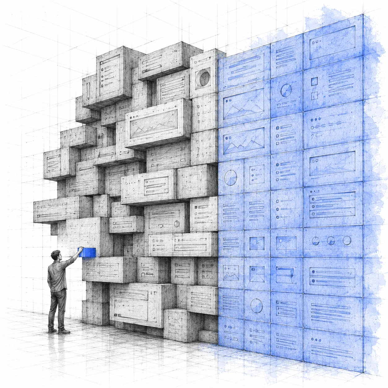
The brief
I built MOB without anyone asking for it, together with a frontend developer, and spent months evangelizing teams that did not believe it was needed. Five years later it was the company's official standard.
And then came the request that makes this case interesting. Leadership wanted to completely modernize the platform's visual language. In parallel, engineering was rebuilding the entire product on a component library, work that could not and should not stop.
Two legitimate requests that, over time, contradicted each other: every sprint built without anticipating the visual change added future rework cost.
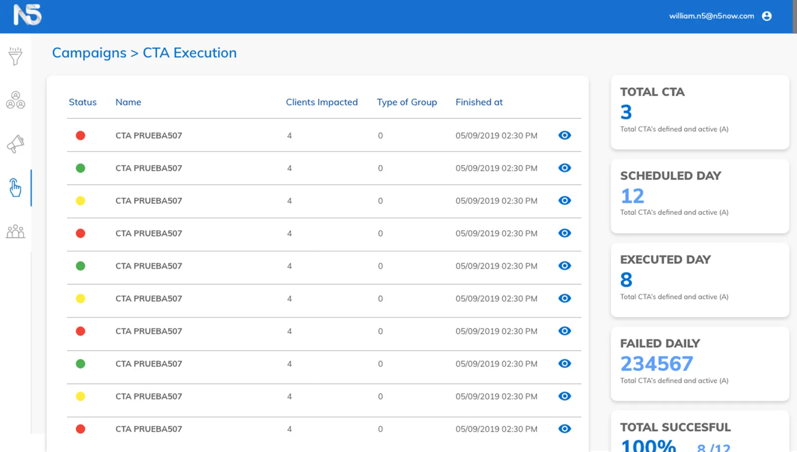 Before MOB
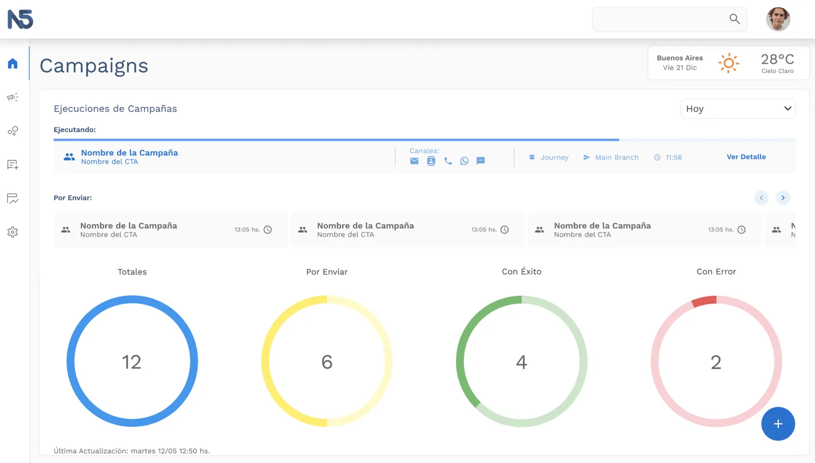 After
After
And the system had three representations that had evolved separately: the design documentation, the actual implementation and the prototyping tool each said something different.
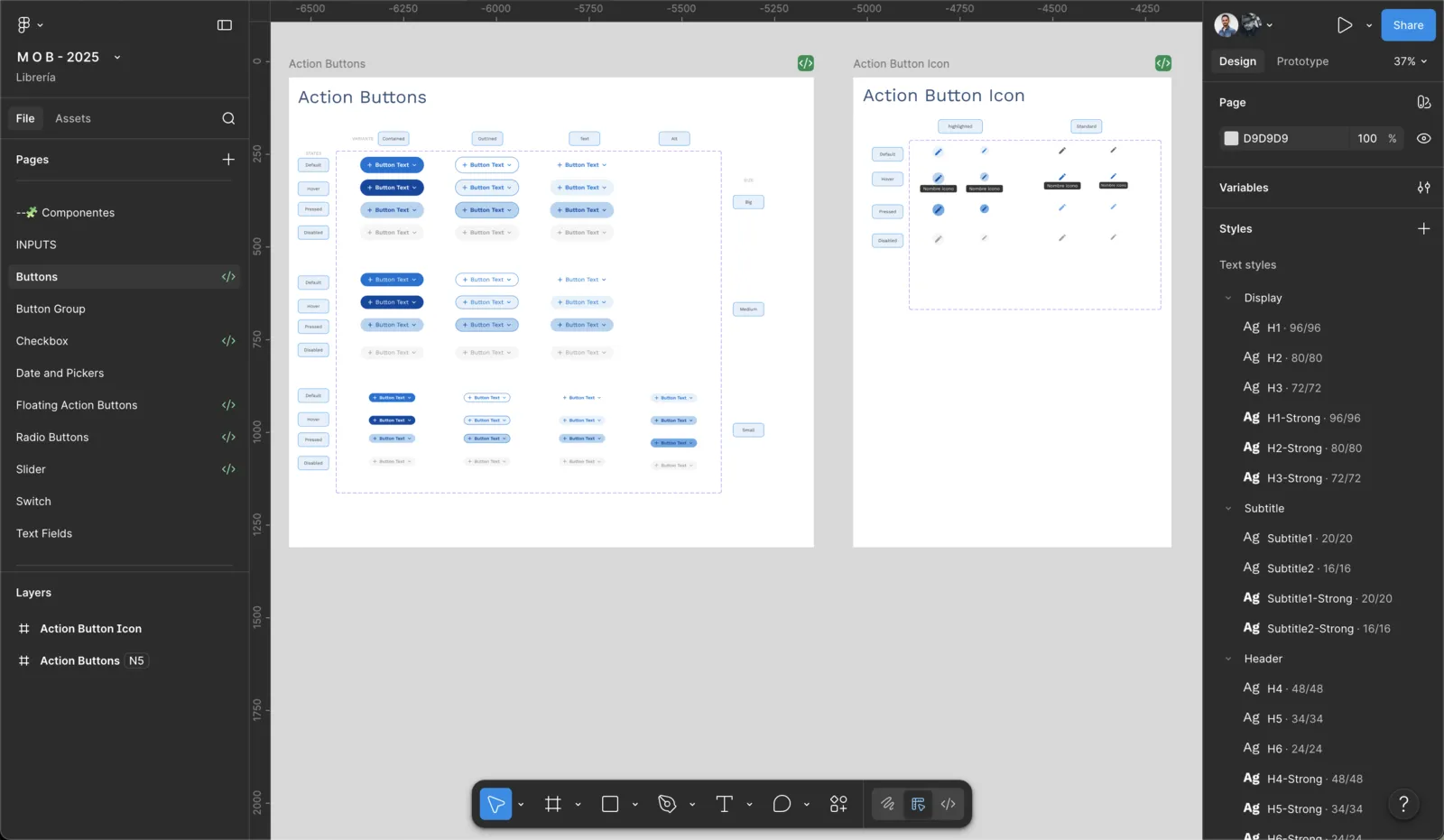
Redesigning the aesthetics on that base would have produced a fourth one.
The bet
Before drawing the new aesthetics I made a structural bet: encode the system that already existed — the old one, the one about to be replaced — into a prototyping tool. Behavior rules, design philosophy, layouts, composition patterns, component-to-component mapping.
Not an inventory of parts: the judgment behind the parts, written so a machine could apply it.
Starting from the old system was deliberate. If the rules were captured apart from the components, the visual layer became swappable.
I validated it by using it. I prototyped with the tool for weeks and kept correcting it with whatever using it surfaced: every time a real screen revealed a badly written rule, the rule got fixed at the source, not on the screen.
Only once the tool was consistent, and with the visual direction already defined, did I swap the components for those of the new library. The layouts and the patterns were left untouched.
Why engineering never had to wait for me
That order is what resolved the contradiction in the brief. Because the layouts and the patterns were independent of the library, the prototypes the team already had were still valid specifications: the same screens, the same behaviors, changing only the components.
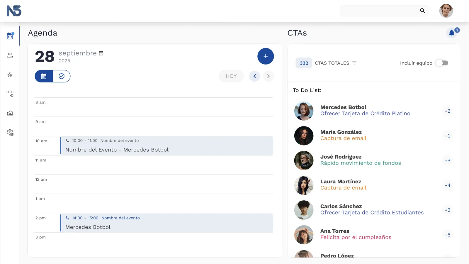 Previous language
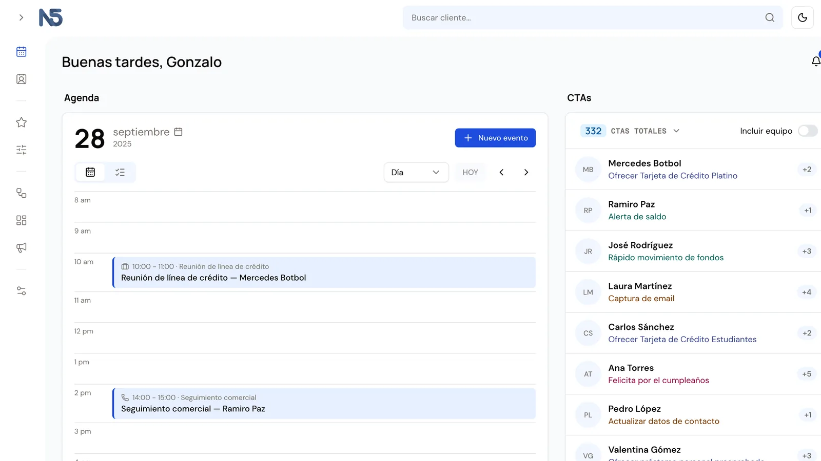 New language
The audit up front confirmed the size of the bet. The real coupling with the old library was concentrated in three places. The 990 lines of behavior specification had only two references to the palette, and seven organisms carried over one to one with nothing touched. The layer that is expensive to rebuild came out intact.
Handing the technical decision back
With the visual language separated from its implementation, a decision appeared that was not technical but about role.
The temptation was to ask for the migration to the new library: I had the argument ready and the visual exploration worked. Instead I delivered the language in a format any stack can implement, and handed the decision back to the frontend team with a mechanism to make it with data. A scoped spike where a developer rebuilds one or two screens with the generated theme and we measure how much of the aesthetic comes out with theming alone.
The criterion was written down in advance, with a numeric threshold and three possible paths depending on the result. In all three, the tokens and the specification are the same investment: nothing gets thrown away. The only thing I asked for in the short term were two hygiene rules at near-zero cost: every style comes out of the theme, and the team consumes a layer of its own instead of the library directly.
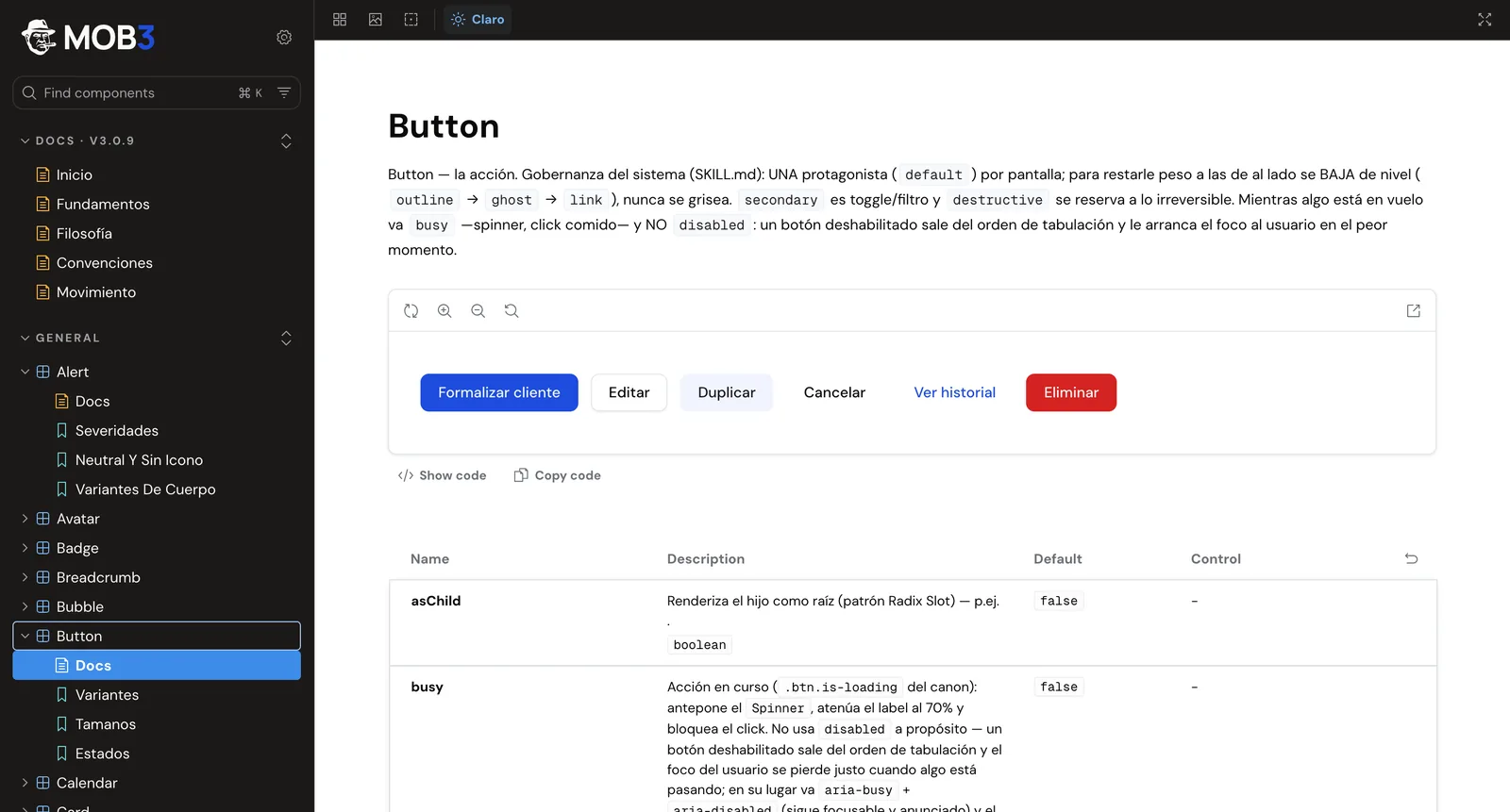
The path ended up being decided by the facts. Today there is a library of 62 components in the new aesthetic, living in the engineering repository with its own Storybook and 196 documented use cases. It grows with every build that moves forward, and the tokens are aligned byte for byte with that repository.
The modules already in clients' hands were left alone: the transition happens where things are being built, not where they already work.
The decisions that hold the system up
The new library brings eleven color roles and nothing else: it covers no semantic states, no chart series, no per-module accents. Instead of designing three separate subsystems I unified them into one, with ten series where the states are aliases, not new colors. The consequence: the red of an error tag and the red of a chart series are the same token and cannot diverge over time.
The entire neutral scale derives from the hue of the brand color at low chroma: changing the brand means changing one line, and the greys recompute themselves.
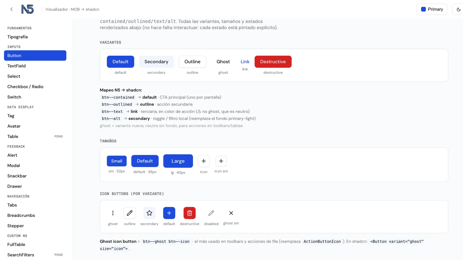 Default brand
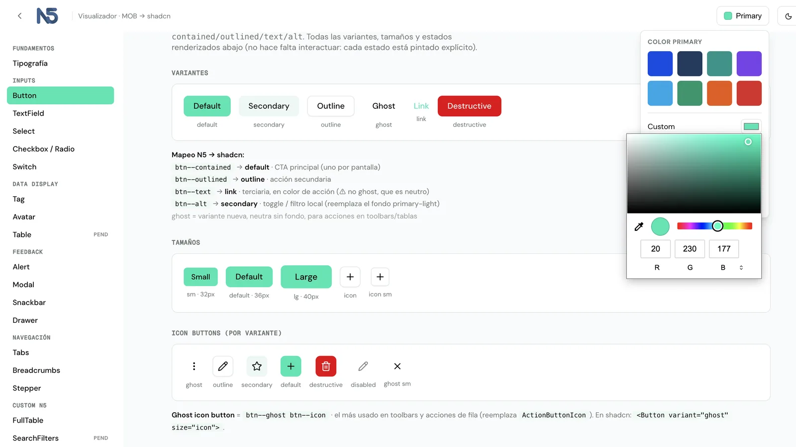 Another primary, live
The rules came out of testing, not out of a manual. Lightness is never touched when warming the greys, so contrast stays intact. And the ceiling is seven percent, because at ten the grey collided with the active state.
Two findings that only show up on a real screen. The background, the hover and the container fell within 0.004 of lightness: the hover on ghost buttons melted into the background, and it was fixed by pushing the background above the hover. And form labels in monospace felt heavy, so mono ended up reserved for overline, caption and micro-text.
What still has not closed
The task category accents were the only color subsystem that did not close right away. There are four (commercial, operational, risk and services) and they have to be told apart from each other and, on top of that, not step on the semantic states, which live on the same wheel.
I turned it into a measurable problem instead of an argument about taste: two criteria, the hue distance between categories and the distance against the states. With that, the original mapping ruled itself out. It had commercial nineteen degrees away from "warning", so a routine task read as an alert.
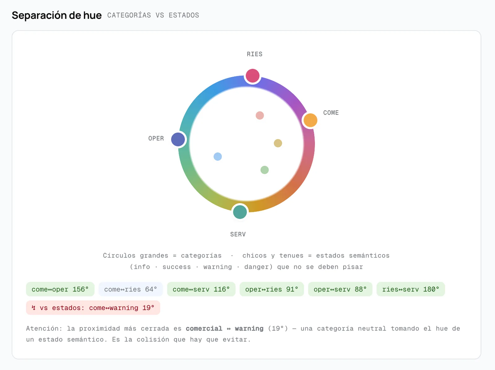
Five variants later the threshold appeared: below fifty degrees of hue, two categories stop being distinguishable.
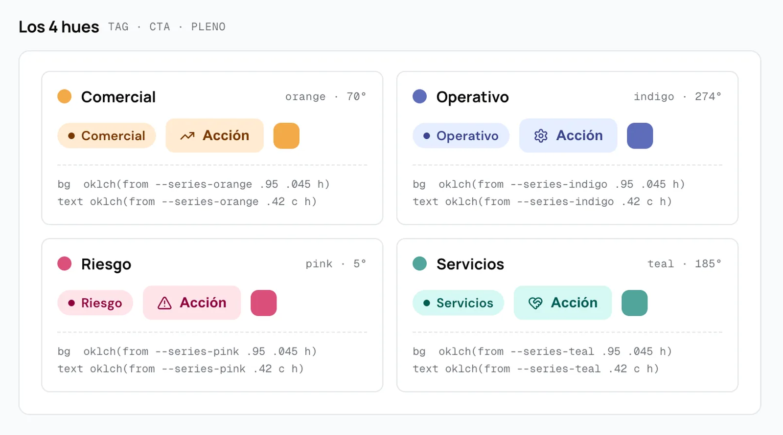
Between the two finalists there is an open trade-off, and the underlying question is not aesthetic but about the product: does the risk category own the alert hue, or does no "positive" category touch yellow? Both answers are defensible and the decision is not mine alone to make.
It stays documented with the full path. When it closes, the change is four lines of token, not a screen by screen review.
The outcome
The most reusable asset was not the screens: it was the layer. The system stopped being documentation someone looks up and became the source the engineering team consumes — including the AI agents they are rebuilding the platform with — and it updates with every decision that gets made.
And it was not only the components that travelled. In that Storybook, next to the 62 components, there are pages on philosophy, conventions, foundations and motion.
Design judgment stopped living in a file someone checks when they remember to: it sits in the same place the code gets written, and both people and machines read it.
The product team uses it without me: my direct report, the Product Director, builds artifacts for commercial demos on top of the tool, without going through design. And everything the company builds today comes out of the same library and the same tokens: the CRM rebuild and the two new products moving in parallel.
It also changed the timescale of prototyping. On one of the new products I adapted the desktop prototype to iOS and Android in a couple of hours, with an audit of twenty-four findings against the platform guidelines — prioritized, resolved and closed — and then to a webapp in fifteen minutes.
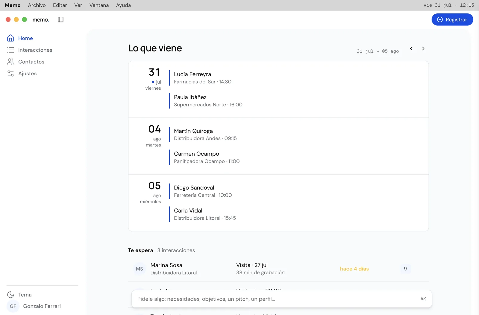
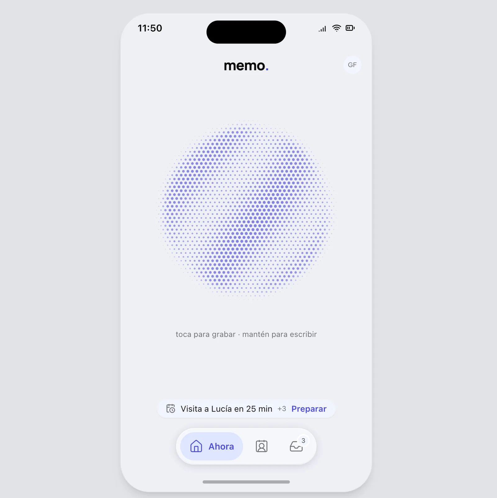 iOS dialect
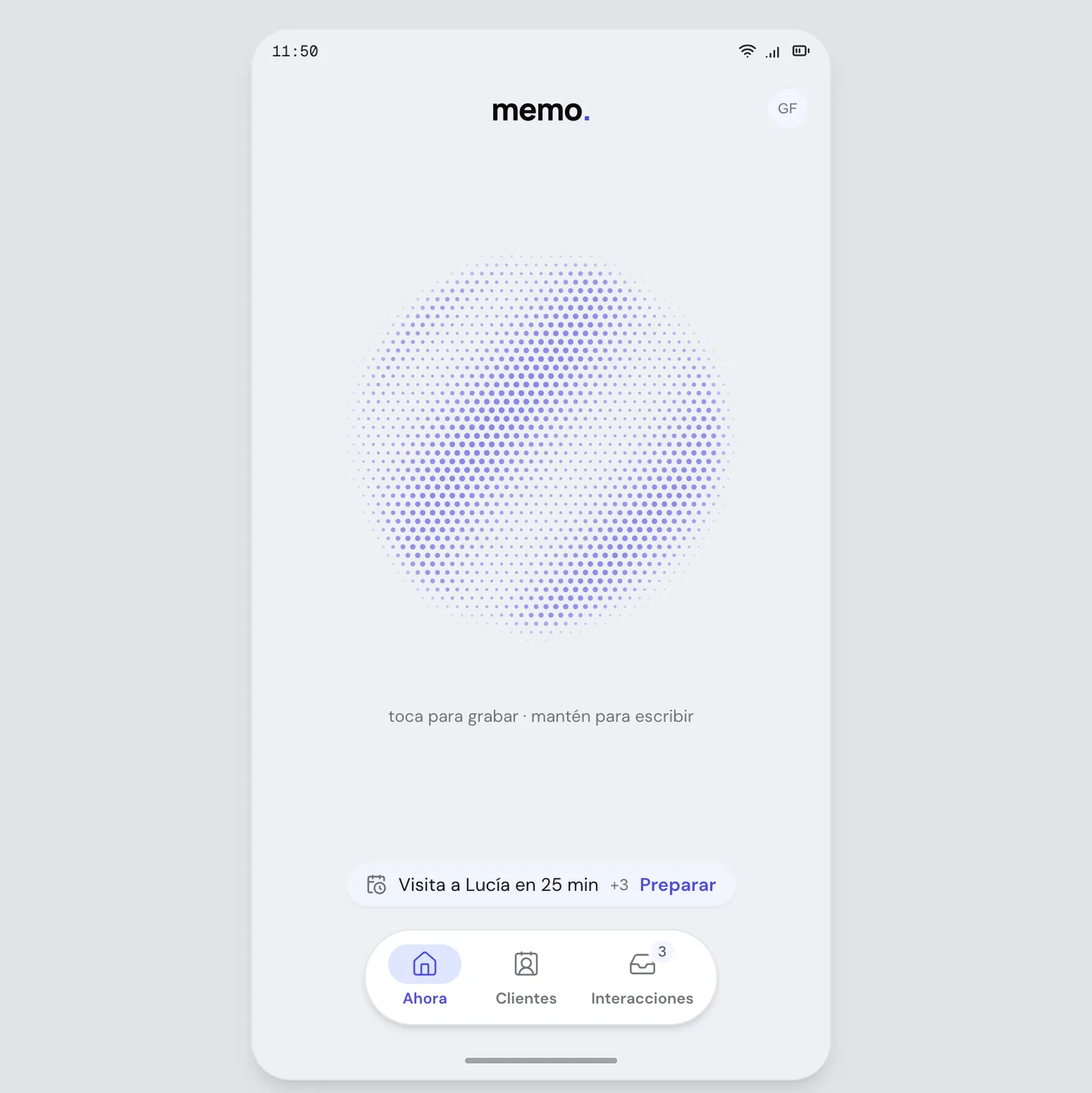 Android dialect
And it maintains itself: every correction that comes up while designing goes into an inbox and is applied to the source with a versioned history. Ten documented consolidations so far. Nothing gets lost in a conversation.
What I take from it. Separating the rules from the parts before touching the aesthetics turned the redesign from a bet into the replacement of a layer. And handing the technical decision back to the frontend team turned an argument about taste into a measurable experiment.