Singular: from zero to two decks in a week
How I used five generative AI tools in parallel to explore six visual directions and change the kind of conversation I was having with the stakeholder.
The brief
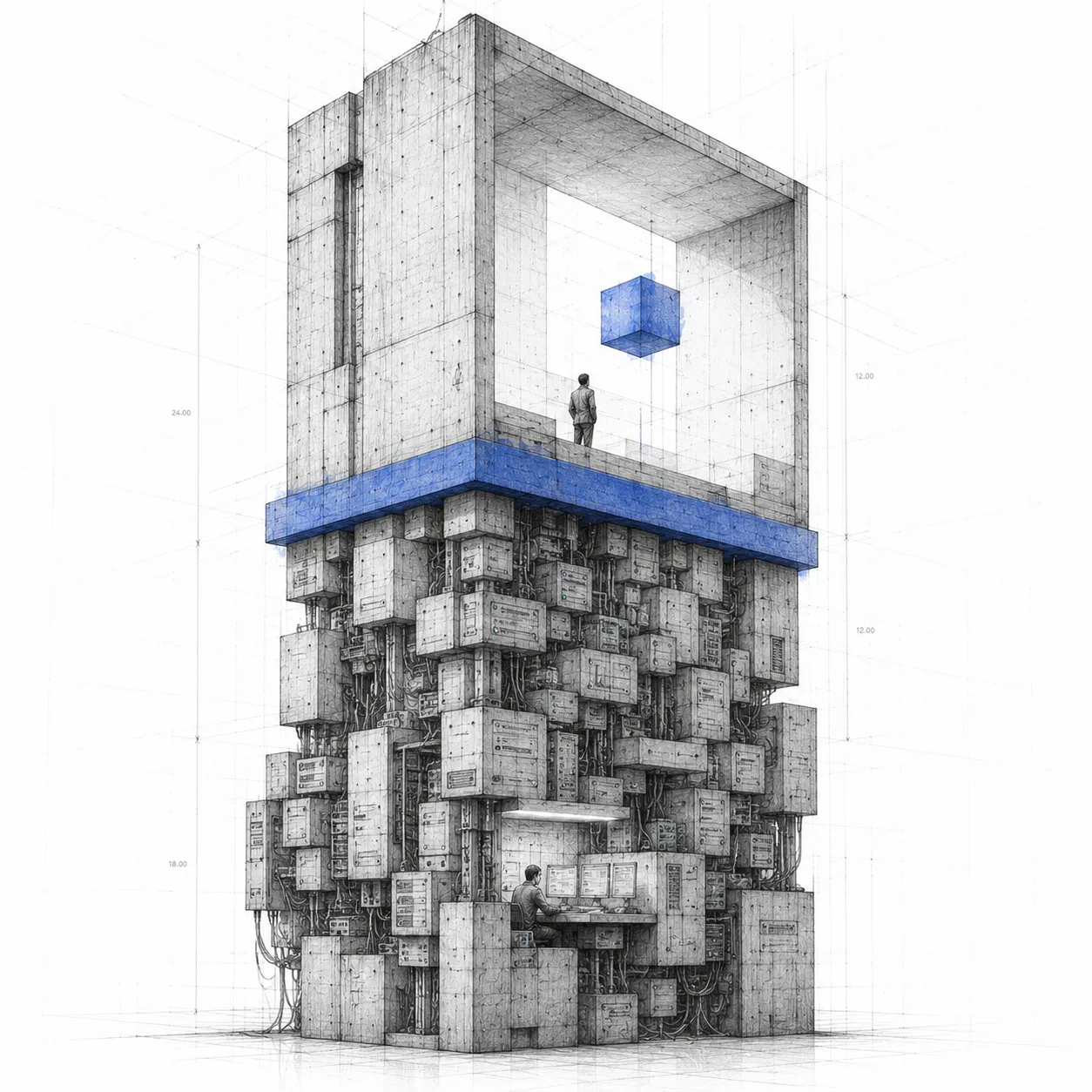
N5's CEO hands down a vision: Singular, a B2B customer engagement platform with AI for banks. There's technical architecture, there's a commercial hypothesis, there's strong intuition about where it sits in the market. What there isn't is a designed product, a visual narrative, or a concrete way to show the team and clients what the thing looks like.
The brief was clear: in one week, produce something that worked both to align internally and to sell. With no more context than that.
The first decision wasn't visual
The first thing I did wasn't open Figma. It was understanding the product. The first design decision I made changed everything that came after.
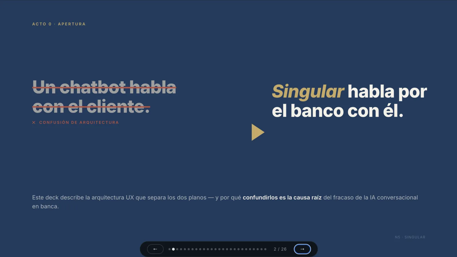
Singular isn't one product: it's two.
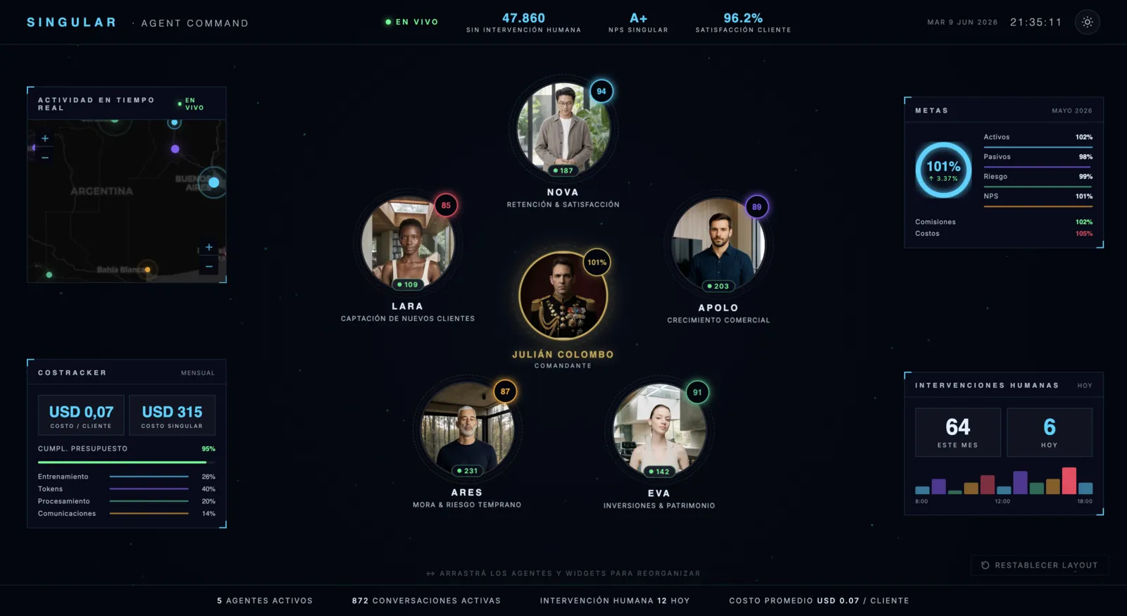
An operations panel for the bank's CRM Manager: high density, dark mode, real-time actions. And an executive panel for the C-level: read-only, top-down narrative, strategic synthesis. Treating them as one thing would have compromised both.
Separating them was the first deliverable of the week, and it was conceptual: I hadn't drawn anything yet. From there the work ran on two parallel tracks.
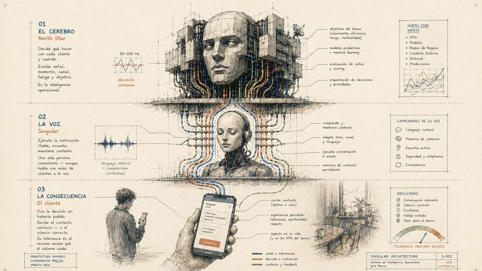
The first was the UX deck, the experience architecture of the whole system. How Singular works as a product, its three layers: the brain that decides, the voice that executes, the customer who lives the consequence.
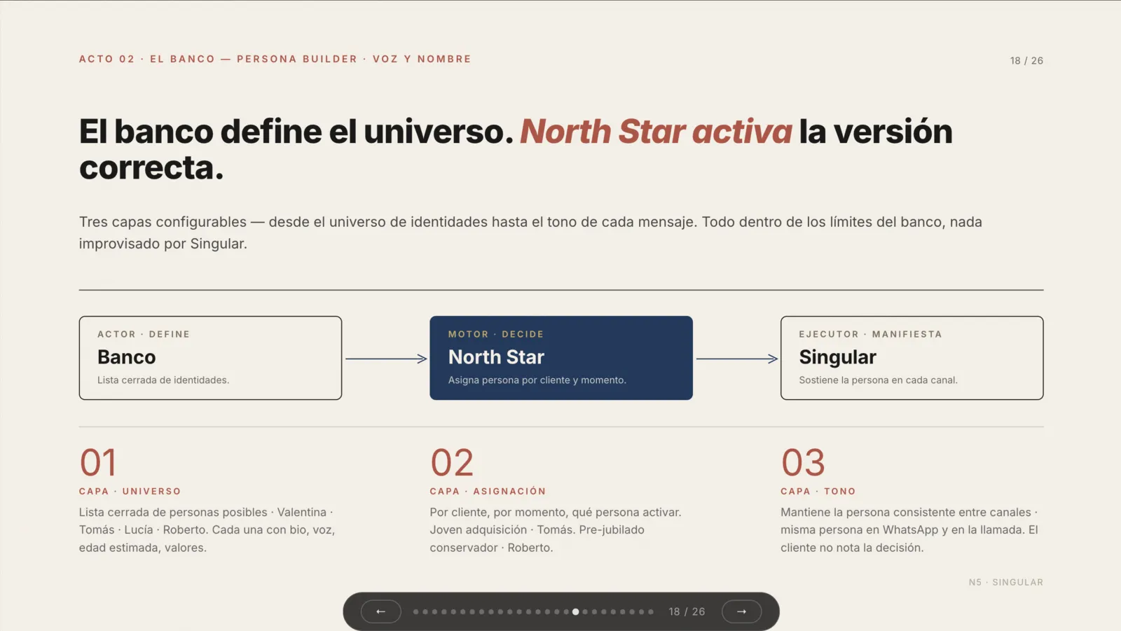 UX deck
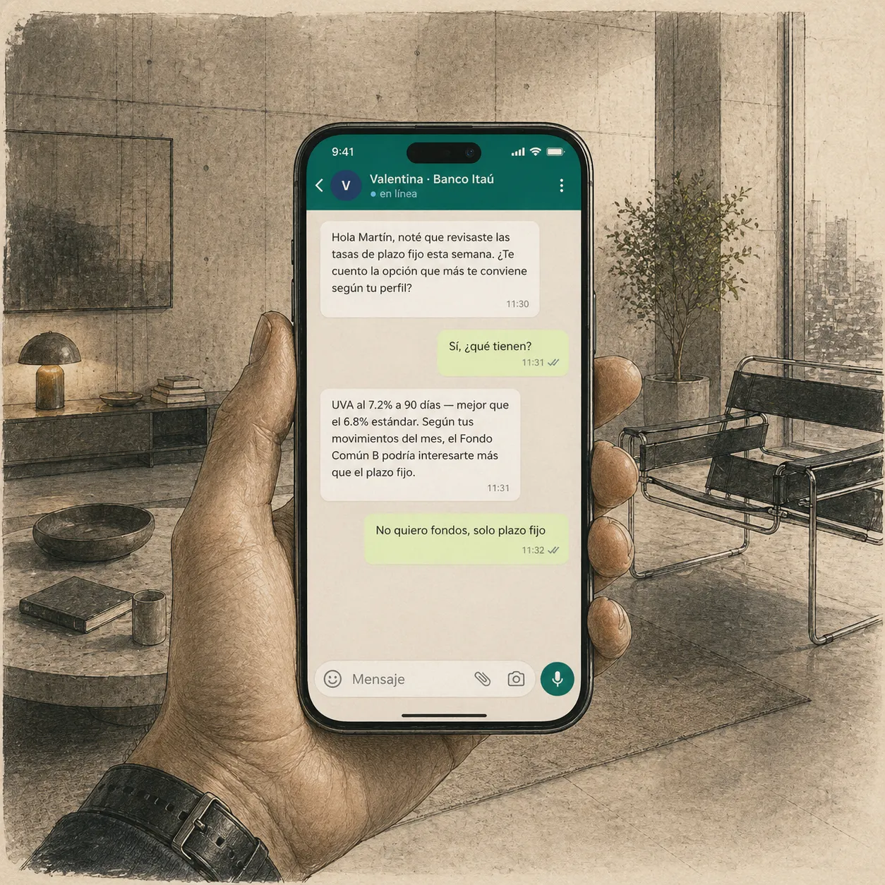 The voice, in the real channel
Mapping the space instead of defending one direction
The second track was the visual exploration of the admin. Instead of proposing one direction and defending it, I decided to map the whole space: five different generative AI tools, the same brief for all of them, six visual variants in parallel. Not to show I could produce a lot, but so the CEO could choose with real judgment instead of approving blind.
Every AI tool has a default voice that pulls toward a style. Fighting it wastes time; using it is what makes exploring six directions in a day possible.
One pulls toward clean fintech, another toward modern software product, another toward extreme density. Using each for what it does best turns a limitation into a method. For every variant I documented which tool was used, what prompt it got, what had to be fixed by hand and how fast it could be iterated. That documentation is part of the deliverable.
| Variant | Visual direction | Tool |
|---|---|---|
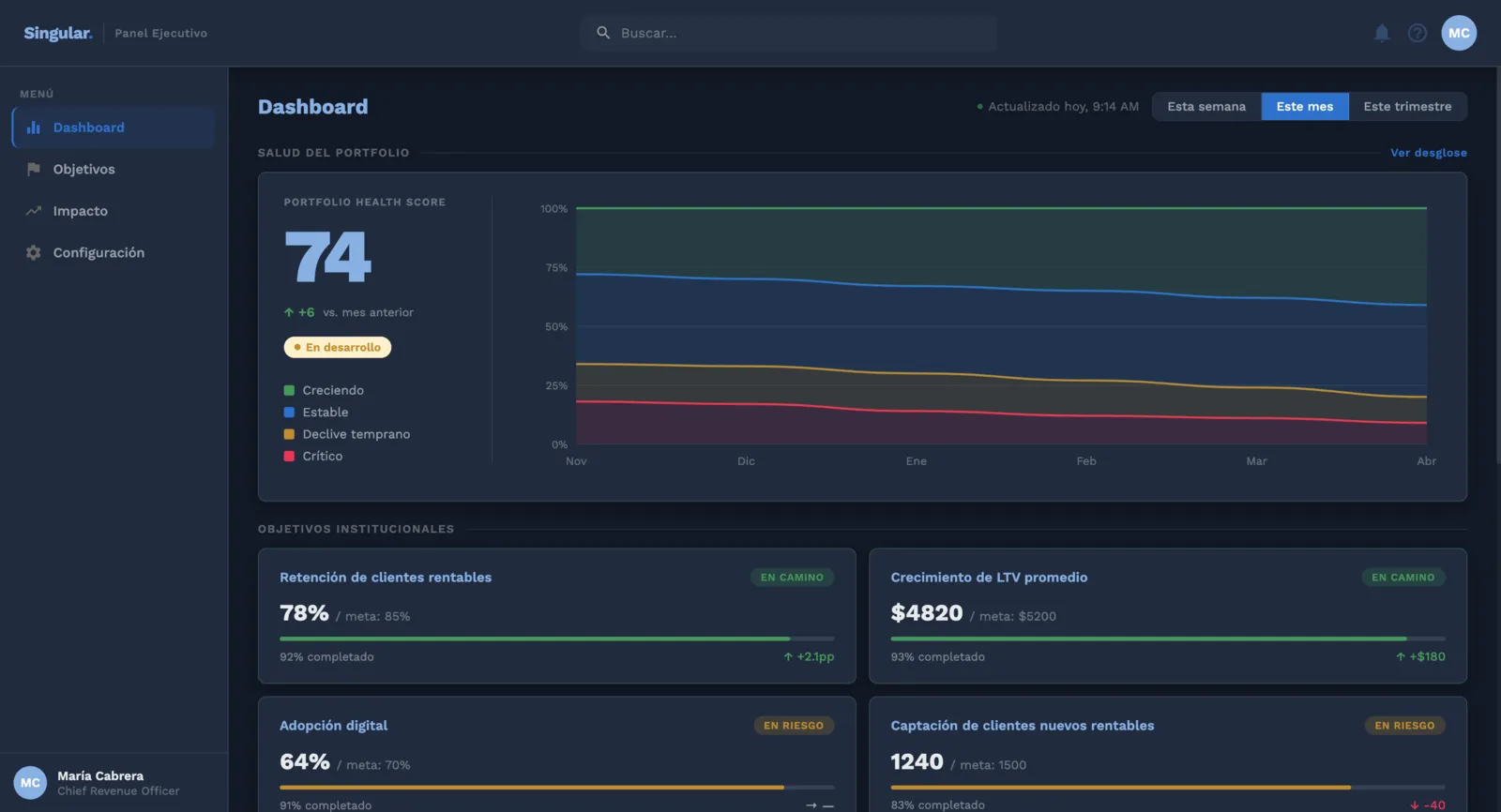
| A | MOB Light — N5's own system, light mode | Claude Design |
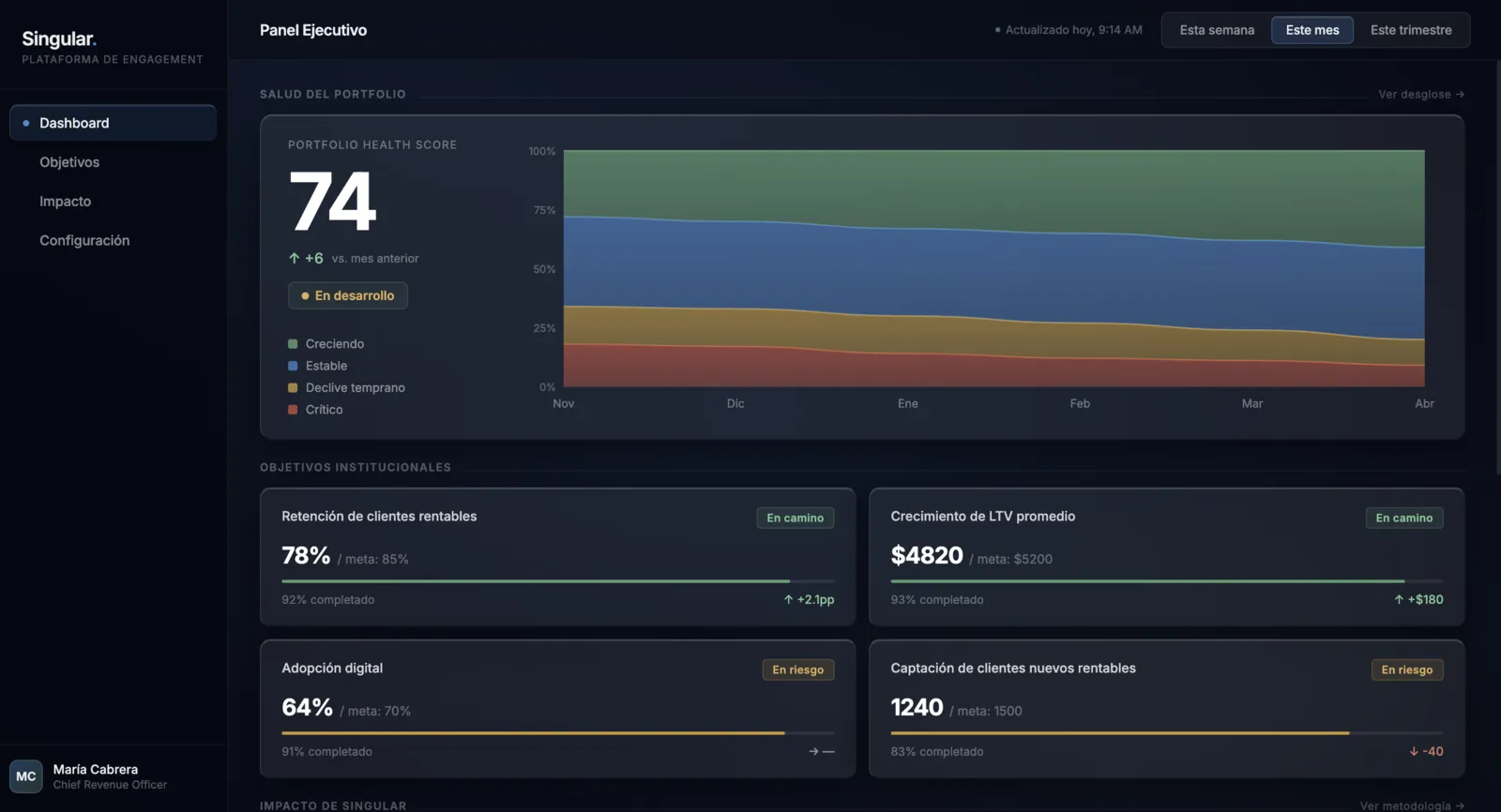
| B | MOB Dark — N5's own system, dark mode | Claude Design |
| C | Liquid Glass — light physics, visionOS applied | Claude Code |
| D | Bloomberg Style — maximum data density | Lovable |
| E | Bugatti — fully monochrome, extreme discipline | Stitch |
| F | Lápiz Dark — editorial cream in dark mode | v0 |
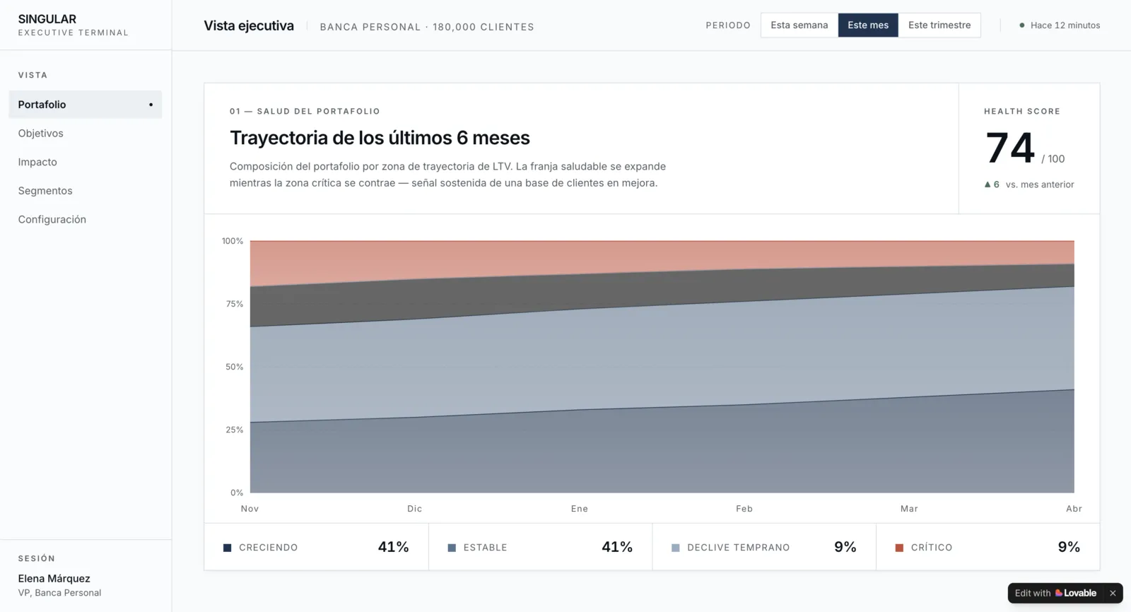
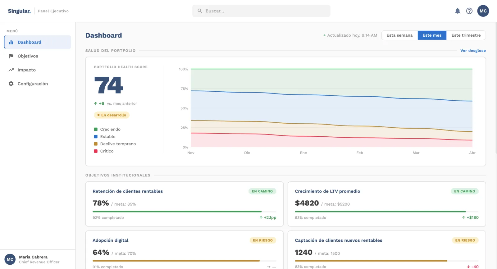 A · MOB Light
 B · MOB Dark
 C · Liquid Glass
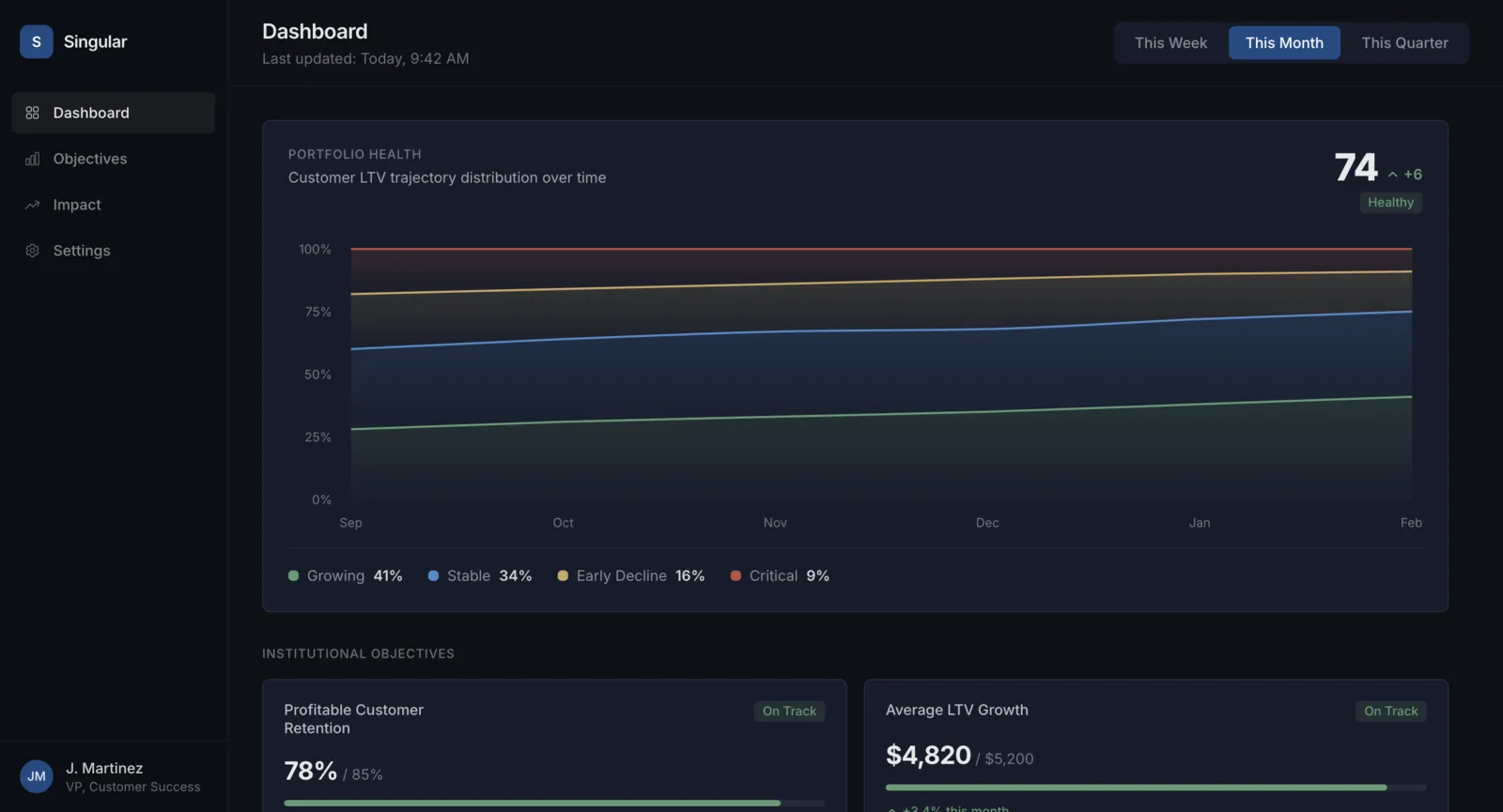 F · Lápiz Dark
The outcome
Two actionable decks by the end of the week. The UX one to align the team on what is being built. The visual one so the CEO could make a real decision about aesthetics and direction, with full traceability of why each variant was considered and why it was dropped.
The methodological thesis behind all of it: AI as co-pilot, not as executor. Every design decision was mine; every asset produced went through at least one tool. The designer's role doesn't disappear. It becomes director, curator and critic of output.
The CEO walked into the final meeting with a real decision to make, and made it: the maximum data density direction. The closest to the real banking context, and the hardest to defend without having explored it against the other five.
What matters most to me about this case isn't the volume produced, but the kind of conversation it enabled. Instead of "here's what I decided", the dynamic became "here's the space, you decide".
And what it proved, at least to me, is that speed used well isn't a shortcut. It's what lets you explore the problem instead of solving only one version of it.
Outside the briefThe demo
Singular has a product in development. But when the CEO needs to give a keynote at Fintech Americas, slides aren't enough. The brief was to take a hard turn: forget the product for a moment and think like a show.
This demo isn't Singular — it's the concept car at the auto show. A working piece so the room can see where the system is heading before it exists.