Mis Resultados: from patch to product
A module to manage sales performance in banks. The real challenge wasn't the interface. It was understanding the true size of the problem and deciding what not to build yet.
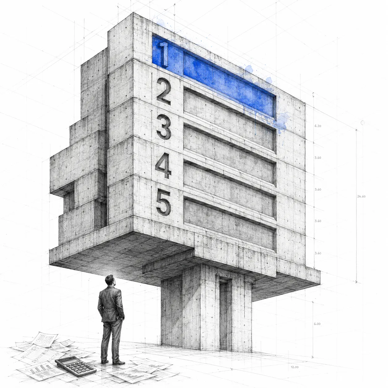
The problem
Banks have large sales teams, with goals, rankings and incentives that change every month. Managing all of that is chaos: Excel spreadsheets, manual configuration, scattered information. Nobody has a clear view of their own performance in real time.
The first version of this platform existed, but it was designed to solve the specific problems of one particular bank. With no admin module, targets and goals had to be configured by hand every month, at an enormous cost the support team absorbed internally.
It wasn't a product: it was a patch.
The problem was bigger than it looked
When I dug into the real scope of the project with the PO, the first thing that became clear was that this wasn't about improving screens: it was about building a platform that could be implemented in any bank, with different business rules, different organizational structures and different incentive models.
The analysis led us to define three user profiles with completely different needs: the Sales rep, who wants to know how they are tracking against their targets; the Supervisor, who needs to see their team's performance; and the Administrator, who configures the system's rules.
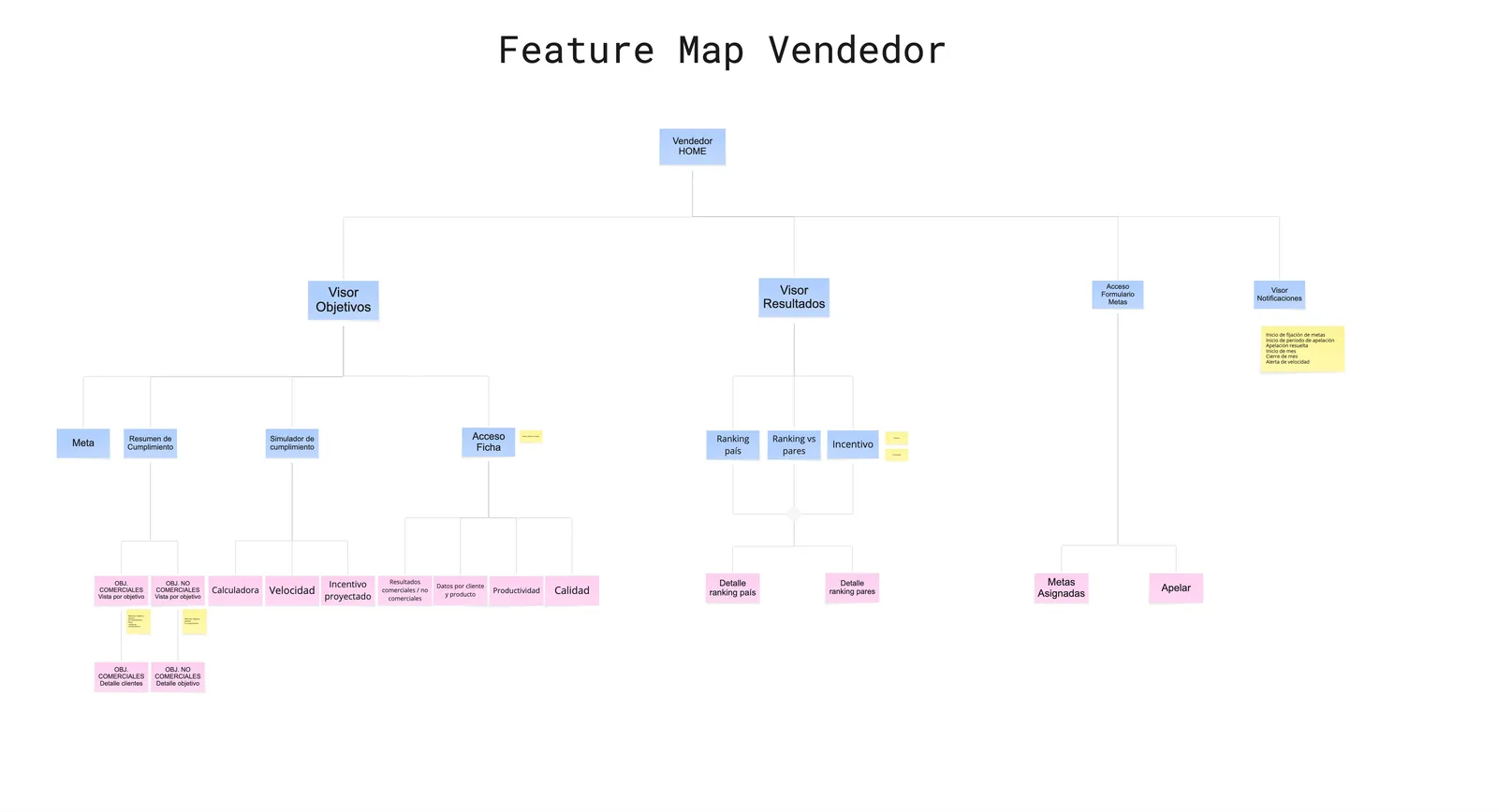 Sales rep
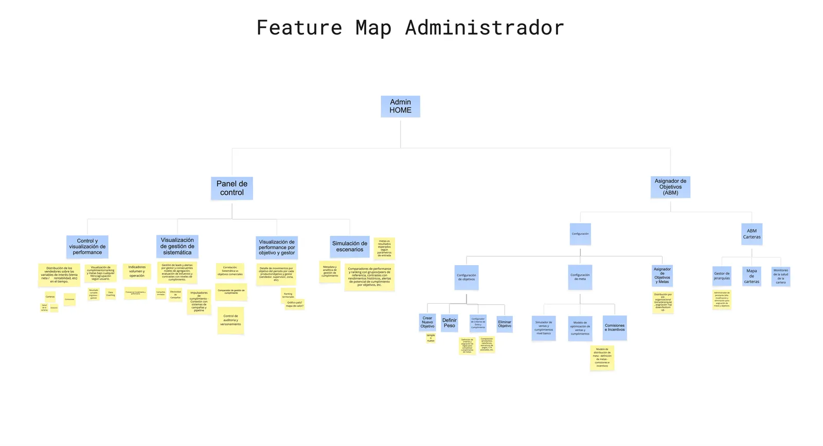 Administrator
The admin module turned out to be that heart. Without it the system can't scale: someone always has to configure something by hand. But designing it properly was enormously complex, and that is where it differs from any traditional incentive system.
A loyalty system for a clothing store is relatively direct: you sold X, you hit the goal. In banking the rules are another matter. If an executive's target is to sell 15 cards in a month and they sold 15, but 3 clients cancelled, their real result is 12. And that is the simplest case. If on top of that 3 of those cards were sold by a call center agent to clients in that executive's portfolio, the count can be half a card, a whole one or none at all, depending on the bank's rule.
Every bank has its own version of that logic. Covering every case without the administrator interface becoming unmanageable was the real product challenge.
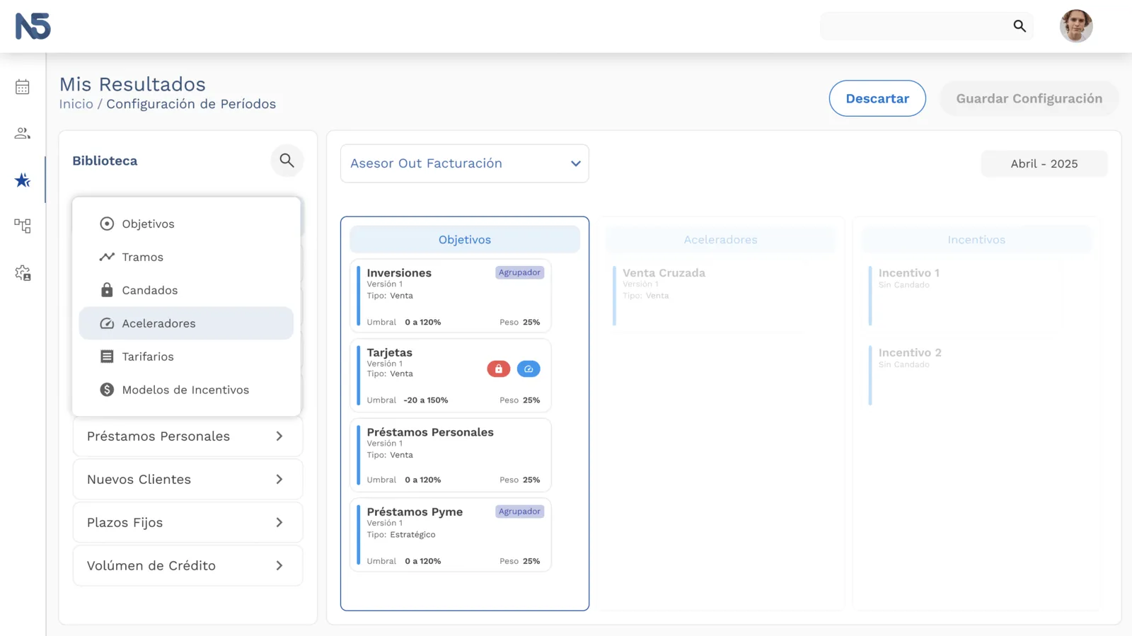
The project was sold for implementation at a large bank in Peru. The scope was ambitious, the timeline tight, and the parties never found the flexibility needed to move forward. The project was left unfinished.
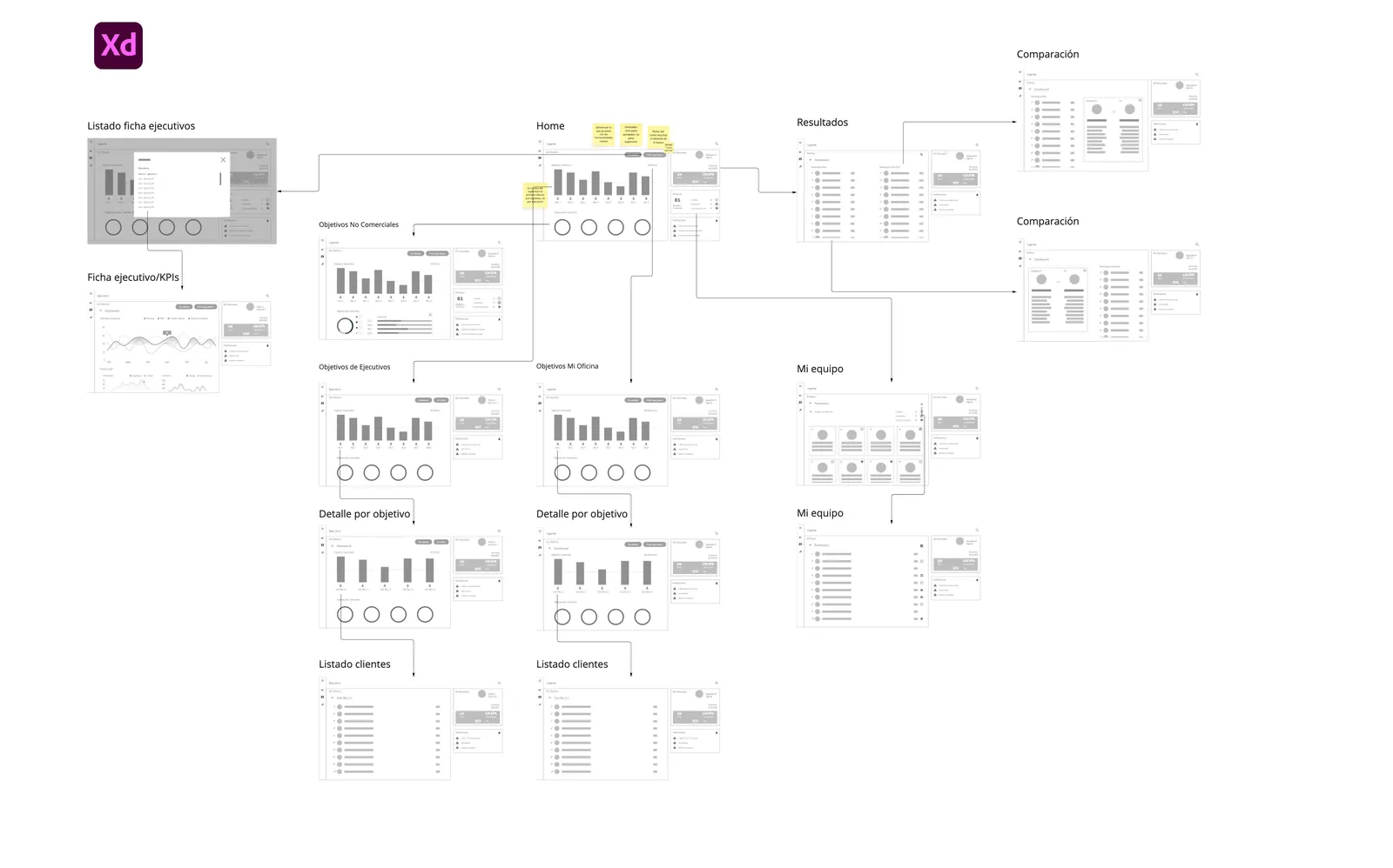
The decision
When v2 started, the question was how to move forward without repeating the same mistake.
Start where there is the most immediate value and the least risk of infinite complexity.
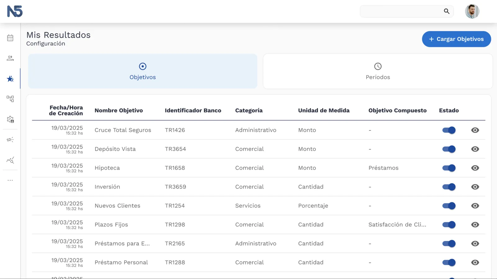
We prioritized Mis Resultados, the performance viewer for sales reps and supervisors, the module with the most impact on the commercial user's day to day. And for the administrator, in this first pass, we went with Excel templates that map the configuration straight into the system: a pragmatic bridge that lets the bank operate without blocking all development on the hardest problem.
The product
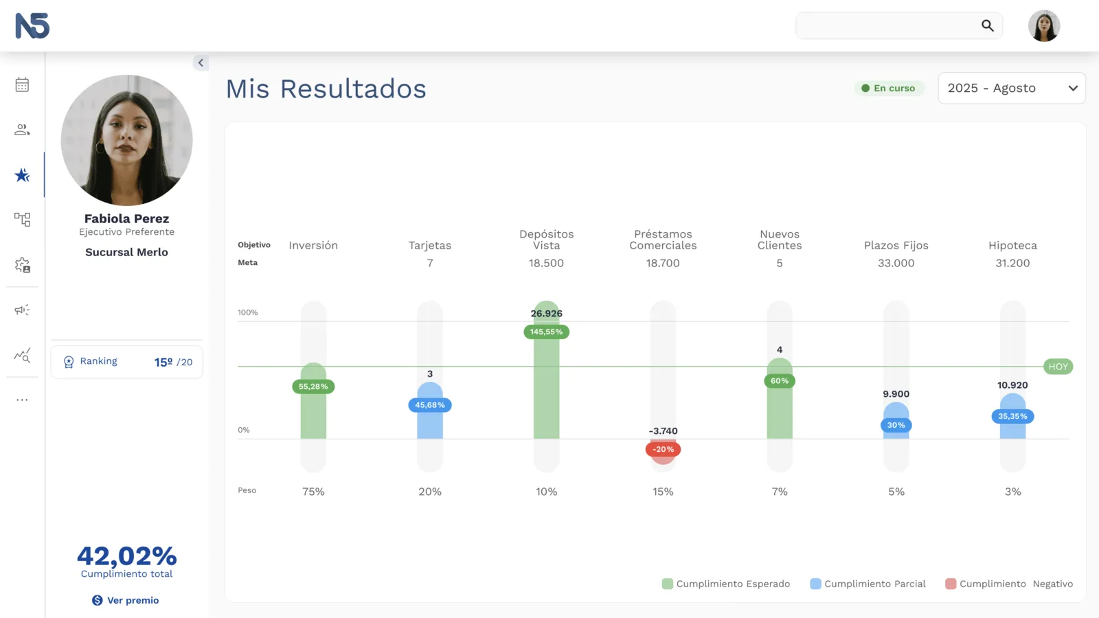
A platform that lets a bank's sales teams see their performance in real time —targets, results, rankings, incentive status— without depending on manual reports or on someone updating a spreadsheet.
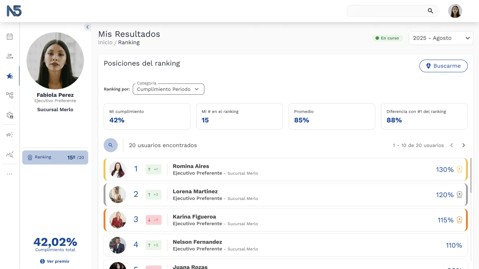 Team ranking
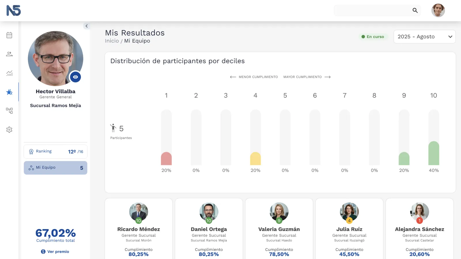 Supervisor view
What matters most about this case is not the product itself, but the process of figuring out where the problem actually was. v0 solved symptoms. v1 found the real size of the challenge. v2 made the hardest call: narrow the scope with judgment, without losing sight of where the system has to go.
Today it is in production in Panama, in implementation in Chile, and coming to Brazil.